The Image Everyone Commissions First
A hero rendering earns attention but rarely answers anything. Decide what each image is for before you pay for it.
 Mikita Dasiukou Founder, Untrue Studio · 5 min read
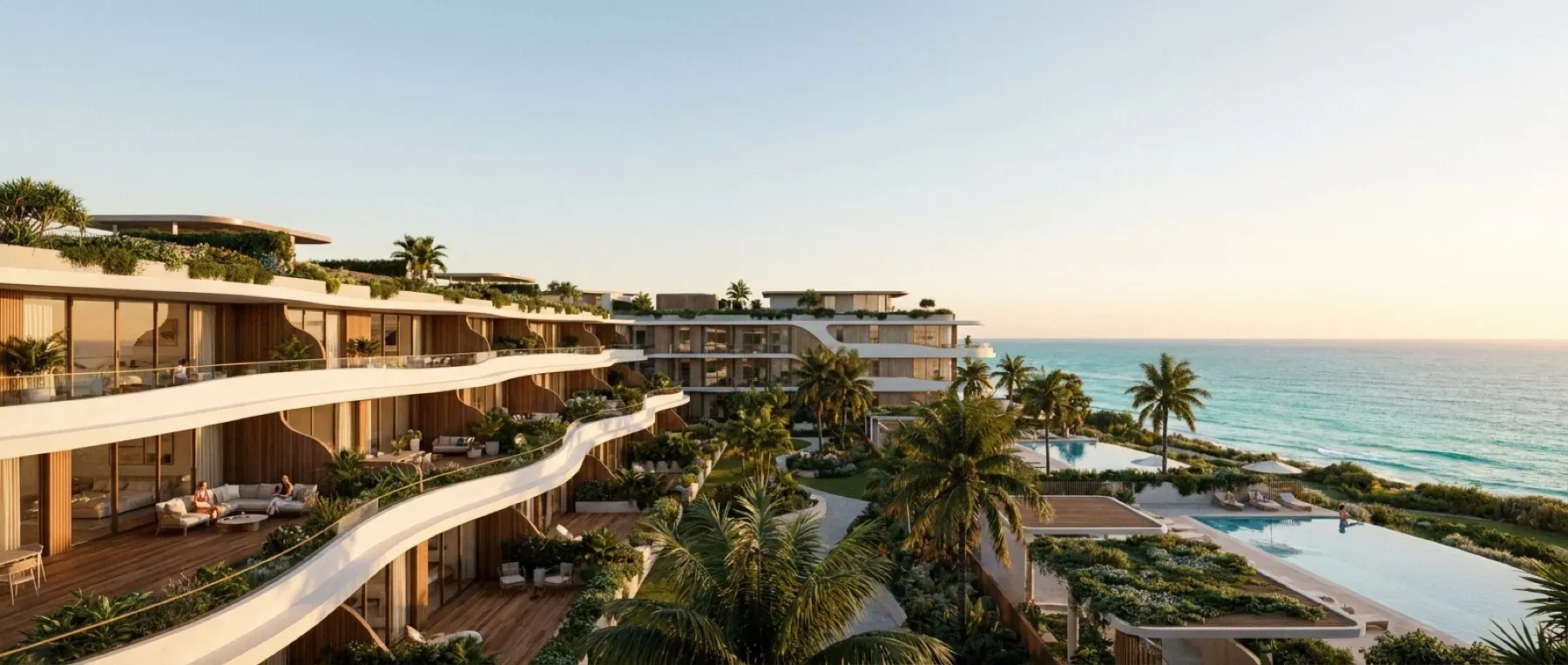
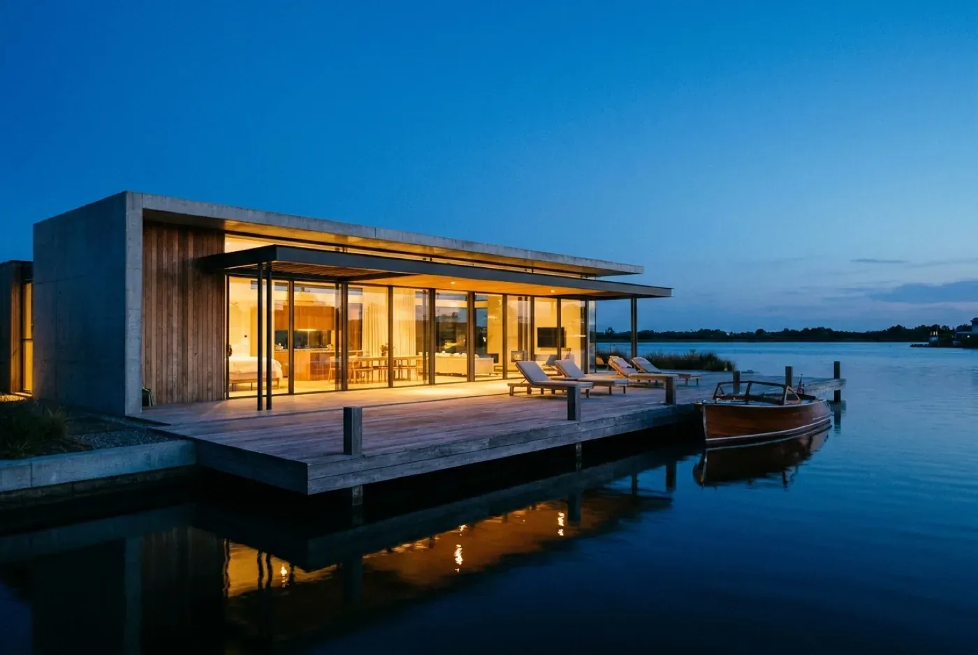
Ask for a presale image list and the first line is almost always the same: the building, from slightly above, at dusk, with warm light in every window.
It is a reasonable place to start. A strong exterior gives the project a face. It goes on the banner, the website, the investor deck and the first page of the brochure. Everyone on the team can look at it and feel that the project is real.
The trouble starts when the second, third and fourth images are the same idea from a different angle. By then the budget has gone on a set of pictures that all say one thing, and the buyer still does not know where the sofa goes.
An image is a piece of work with a job
The fix is simple to describe and slightly uncomfortable to do. Before commissioning an image, decide what it is for.
A presale image can do one of four jobs. Each one is useful. They are rarely done well by the same picture.
| Job | What it does | Typical image |
|---|---|---|
| Stop | Earns attention and gives the project a face | Hero exterior, street view at its best hour |
| Orient | Shows where things are and how they relate | Site view, building in its context, unit location |
| Explain | Answers a practical question about the home | Main living space, kitchen, primary bedroom, view from a real floor |
| Reassure | Shows that someone has thought about the detail | Material close-up, entry sequence, parking, storage |
Most image lists are heavy on the first job and light on the other three. That makes sense when you are selling a project to a lender, a partner or a board. A buyer choosing a home needs more of the third and fourth.
Sort your shot list by question
Take your current list and add a column. For each image, write the question it answers for a buyer, in the buyer’s own words. Not “showcases the architecture.” Something a person would say out loud.
Here is what that might look like for a townhouse project.
| Image | The buyer’s question | Keep? |
|---|---|---|
| Exterior at dusk from above | Is this project worth a closer look? | Yes, one |
| Exterior at dusk, second angle | Same question | Cut |
| Street-level view from the sidewalk | What will it look like when I come home? | Yes |
| Living and kitchen, most common plan | Is this space big enough for us? | Yes |
| Primary bedroom, most common plan | Where does the bed go, and what is out the window? | Yes |
| Rooftop deck at sunset | What do I get up there? | Yes, if the deck is a reason to buy |
| Model lifestyle shot with no specific home | None that I can name | Cut |
The third column is where the arguments happen, and they are good arguments to have before anyone has been paid. If nobody on the team can name the question an image answers, it probably should not exist.
What I would commission first
Every project is different, and this order should bend to yours. If you have nothing else to go on, it is a sound default for a small residential project.
- One hero exterior. Give it real care, because it will be used everywhere. One is enough at the start.
- The street-level view. Set the camera at eye height, from a place a person could actually stand. It is less dramatic than the aerial and much closer to the truth of coming home.
- The main living space of the plan you expect to sell most. Buyers should be able to see the kitchen, the seating area and the window wall together, and read the size of the room.
- The primary bedroom of the same plan. Include the window, because that is what the buyer is trying to picture.
- Marketing floor plans for every plan type. They are not images in the usual sense, but they answer more questions than anything above. A floor plan has two readers, and this is the one the buyer reads.
- Whatever your own test exposes. Run the ten-question test on what you have, then let the failures choose the next images.
Amenity images come after this, and only for amenities that change a buyer’s mind. A shared courtyard that defines the project earns its image. A bike room probably does not need one.
Three ways image budgets disappear
Repeating the same idea. Dusk from the left, dusk from the right, dusk a little higher. Each one is attractive, and together they answer one question three times.
Showing the best home to everyone. It is tempting to render the largest plan with the best view, because it makes the best picture. If most of your homes are not that home, you have shown most of your buyers something they cannot buy. Show the plan people will actually choose, and label what it is.
Ordering too early. An image of a kitchen that is still being redesigned costs money twice. Wait until the decisions it depends on have been made, or be clear about which parts are placeholders. What to have ready before you commission goes through those decisions.
Keep the hero, and keep it honest
None of this is an argument against a beautiful hero image. It is often the reason someone looks at the project at all. It just should not be doing everyone else’s job.
There is also a quieter reason to keep it in proportion. Hero images are where atmosphere runs furthest from fact: the perfect hour, the mature trees, the empty street. That is acceptable when the picture is plainly doing the job of attracting attention. It becomes a problem when it is the only thing a buyer has to go on. What a rendering is allowed to promise takes that further.
So commission the hero, and make it good. Then ask what the buyer needs to see next, and spend the rest of the budget answering that.